Published in the Winter 2024 issue of Artisan Spirits Magazine.
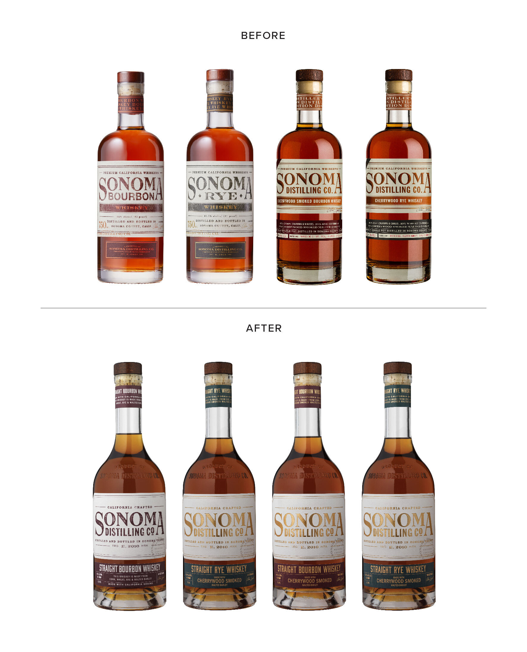
In 2020, Corning & Company made the decision to revamp the packaging for their line of whiskeys under the Sonoma Distilling Co. brand.
The brand had recently undergone a packaging redesign with another agency, however, as they grew into a larger-scale facility and expanded their product line to specialty products, the necessity for developing a flexible packaging system became clear. In addition, their brand wordmark was used inconsistently across the range of products. On some spirits the full “Sonoma Distilling Co.” wordmark was used while on others it was simply “Sonoma Bourbon” or “Sonoma Rye”.
The goal of the redesign was to position the brand for continued growth with a nimble packaging system and strong, consistent brand messaging that would create a billboard effect when products were placed together. Special attention needed to be given to establishing a clear system that allowed for product expansion from their core tier into their specialty, single barrel, and cream liqueur tiers.
- CF Napa designed a custom glass bottle with cartouches of the Sonoma Distilling Co. logo. The transition from a stock bottle to a custom bottle had the added benefit of giving the brand control over their glass supply chain. The craft spirits boom exponentially increased the demand for glass bottles making them harder to acquire. Sonoma Distilling Co.’s custom bottle allows for a consistent, exclusive line of supply.
- To honor the brand’s Sonoma County wine country roots, the bottle was inspired by the shape of a traditional wine bottle, including an elegant neck and an exaggerated punt in the bottom of the bottle.
- CF Napa pulled the product name out of the existing logo lock-up and utilized one “Sonoma Distilling Co.” brand mark across the range.
- A double-label system was developed with the main label prominently displaying the wordmark and messaging supporting their status as a Sonoma County, locally produced brand. The label panel devoted to the logo increased visibility from a back bar. The secondary strip label made products easily discernable by organizing the product name and SKU-specific information in one location across all spirits.
- A color-coding system was also developed to aid in product recognition across tiers. All Bourbons utilized a maroon color, all Rye products used a green hue, and specialty items had their own color designations. The Cherrywood Smoked Whiskeys utilized a gold foil wordmark to set these special spirits apart. The Black Truffle Rye used gold foil lettering against a dark black label, clearly differentiating it from the rest of the portfolio.
The new design started to hit the market in the summer of 2022 with select products and had fully launched by Q1 2023. The new look received an overwhelmingly positive response. In less than 1 year of the new design in market, the new look had won Gold in the prestigious Global Spirits Design Master competition hosted by the Spirits Business and it won Gold for Best Relaunch/Redesign in the World Whiskies Awards.
“We have been working with CF Napa for years and are always extremely happy with their creative work. When the decision was made to rebrand the Sonoma Distilling Co. products, we felt confident that the CF Napa team would do a fantastic job. Packaging is always a much bigger beast than you imagine when you aren’t working in that space every day. There is a delicate balance in capturing the artful and emotional aspects with the practical needs of the packaging, but CF Napa was able to deliver on all fronts. The new bottles and labels truly evoke our sense of place here in wine country, and we could not be more pleased with the results.”
– Samuel D. Long, CEO & Chairman of Corning & Company.
- A Brand to Aspire to - March 30, 2026
- The Core 4 – Setting the Foundation for Your Brand - September 19, 2025
- The Rise of Low & No Alcohol Spirits: A $4 Billion Bandwagon - July 21, 2025


Leave a Reply