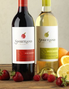
When consumers are choosing a wine, spirit or beer from the shelf or at a restaurant, they are influenced both by analytical and aesthetic cues provided by the packaging and its label hierarchy of information. Here’s what you need to know about this delicate balance to influence consumers to choose your product over your competitor’s.
Typical Hierarchy
In very general terms a typical label hierarchy from most prominent to the least prominent is as follows:
- Brand Name
- Product Type/Flavor (Gin, Pilsner, Cabernet Sauvignon, Mandarin Vodka, etc.)
- Sourcing (Appellation, source of grains, etc.)
- Vintage Date, Bottle Number, Production Level
- Endorsements & Qualifiers (Awards, founder’s signature, etc.)
- Alcohol % and Legal Mandatories (Legal information required by the country product where it is sold.)
How Product Type and Sales Channel Shifts Hierarchy
Consider the various channels in which the product will be sold. For instance, label information for spirits brands that are sold on-premise should be much larger on the label so that it can be easily read by consumers scanning the back bar.
Many consumers are very loyal to particular spirits brands so the brand name needs to be easy to read from a distance. In many cases flavor may take the lead in the hierarchy; e.g. flavored Vodka or Liqueur so that bartenders can easily find the correct flavored Vodka to make a pomegranate martini and consumers can quickly call out their favorite cinnamon shooter.
Conversely, wine packaging information can typically afford to be much smaller regardless of sales channel. Consumers shopping retail shelves are right in front of the product, and on-premise sales of wine often occurs off of a list and the bottle is hand-presented to the consumer, making it possible to leverage more subtle communication.
The DO’s and Don’ts
Do make sure your brand name stands out.
Don’t make the consumer search for your brand name in an unlikely place or try to find it within a camouflaging design.
Do use color, boldness and scale to differentiate hierarchy instead of or in addition to location on your packaging.
Don’t assume because something is at the top of a label it is highest in the hierarchy. Hierarchy is a visual balance not a top of label to bottom of label exercise. e.g. If a piece of information is the boldest item on the label, but located in the middle of the label the consumers’ eye will go their first rather than to the top of the label, thus it is first in the hierarchy.
Do consider whether a fanciful or sub-brand name should be the highest in the hierarchy rather than your brand name.
Don’t assume your brand name has to be the highest in the hierarchy. You may want your sub-brand name larger and endorsed by your brand name. This is a particularly useful strategy for less expensive tiers or portfolio offerings that are transitioning to the sub-brand name and away from a connection to the primary brand.
Do make the type of alcohol descriptor easily scan-able on the packaging. Many times it helps to reinforce this information with corresponding flavor cues including color to assist the consumer in discerning the product’s type or flavor profile.
Don’t assume that since it will be shelved by product type that consumers will easily understand what the product is without strong messaging.
- A Brand to Aspire to - March 30, 2026
- The Core 4 – Setting the Foundation for Your Brand - September 19, 2025
- The Rise of Low & No Alcohol Spirits: A $4 Billion Bandwagon - July 21, 2025


Leave a Reply