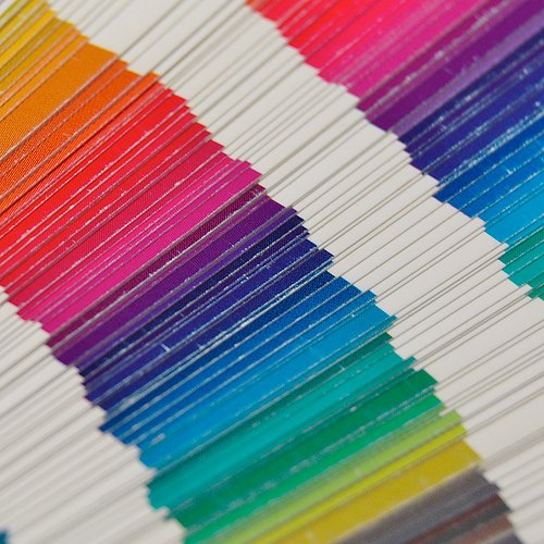
Color in branding plays an integral role in reaching your consumer, driving engagement and boosting SALES.
Color, though one of the most obvious elements of your brand’s identity and packaging, is often one of the most overlooked, underleveraged and misunderstood. Below, I discuss how color can impact your branding and marketing efforts along with the three reasons to leverage color in your alcohol packaging.
3 Reasons to Leverage Color in Your Alcohol Packaging
- Color Communicates Your Product’s Key Attributes
Since color plays such a large role in a consumer’s decision to purchase a product, it’s obviously important to consider color in your package design. It can communicate flavor, product style, quality level and support cultural relevancy.
Flavor
When done correctly, color allows consumers to quickly access the flavor of your product by simply scanning the shelf and your package. For example, if the consumer is looking for a lemon-flavored vodka, yellow is going to be an important color to leverage. Use of color becomes more crucial when your product offerings include multiple flavor options. Thought should be given to how those flavor colors interact with the brand color.
Product Syle
Richer colors like deep reds and browns can evoke a sense of richness for your product whereas brighter yellows or greens can communicate crisp, refreshing attributes.
Product Quality
Color can play a large role in the quality perception of your product. For instance, a black or darker tone packaging and gold foil can speak to a more premium quality while brighter, friendly colors may speak to a more everyday product.
Cultural Relevancy
Color carries strong cultural meanings and sends subliminal messages that can help communicate critical attributes of your product that speak to its quality and authenticity. For example, in Western cultures the color red symbolizes passion, energy and a warning to stop. In Eastern cultures, it is a symbol of good fortune, prosperity and a symbol of joy. Blue in Western cultures symbolizes trust, authority and calm, but in Eastern cultures it symbolizes immortality and femininity. In Korea, blue is a color of mourning.
- Color Increases Memorability
By hanging an extra ‘tag’ of color in packaging, consumers are able to process and store images more efficiently than a colorless alternative and, as a result, recall is improved.
Before brand loyalty can be established, you must first earn mindshare.
As your consumer interacts with your alcohol brand for the first time, they are cataloging that experience in their memory and forming opinions about the experience without even knowing it.
Color can play a key role in creating memorability by supporting brand attributes or by simply being disruptive vs. the competition. This doesn’t mean that the brightest or loudest colored packaging is always the right solution. Instead, thoughtfully choose color that fits with your product flavor profile, story and the overall messaging. Also, consider whether there is an opportunity to leverage a color that could represent your brand as a whole; e.g. Skyy Vodka’s blue bottle or Coca-Cola’s red.
- Color Increases Engagement
A product on shelf has one-twentieth of a second to grab the consumer’s attention.
Color and Sales
According to a 2004 study conducted by the Seoul International Color Expo, more than 92% of respondents said that visual factors are the most important when purchasing products.
Furthermore, when asked the importance of color when buying products, more than 84% of respondents thought color was more important than half of the various factors important for choosing products.
Tests indicate that a black and white image may sustain interest for less than two-thirds of a second, whereas an image that is color may hold the attention of a consumer for over two seconds. Black and white does have a place in alcohol beverage branding, in fact it can be very successful, but considering consumers’ attention spans are short and distracted (especially in the retail environment), the proper use of even a little bit of color may help to increase consumer engagement and sales.
photo credit: christianmeichtry via photopin cc
- A Brand to Aspire to - March 30, 2026
- The Core 4 – Setting the Foundation for Your Brand - September 19, 2025
- The Rise of Low & No Alcohol Spirits: A $4 Billion Bandwagon - July 21, 2025


In a world with the most label full in white or soft cream colors, where wineries are seeking tradition and elegance, the colored labels are a scream who stand out on shelves.
A powerful color can be many things like a tool to discriminate and make a difference with the competition. It’s easier for the client fixes the focus in the color point in the sea of white labels.
We need to remember always how important, it’s the color, because it can be the stamp of the brand. A clear example of that its Veuve Clicquot and Ferrari. When you consider their color, you know “hey! That’s Ferrari’s red”.
The color it’s one of the most powerful weapons we have in this industry and we need to teach our clients about how much value they can have with this correct use of it.