4 packaging innovations and considerations brand owners should be aware of while implementing a new design.
Utilizing the latest packaging technologies and innovations is a great way to optimize your brand’s presence and win mindshare with consumers. Below are 4 great packaging innovations along with tips on how to implement them, sources and packaging examples where they can be used cost effectively.
- Cast Metal, Pewter and Wood Labels
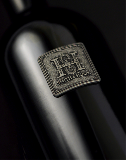
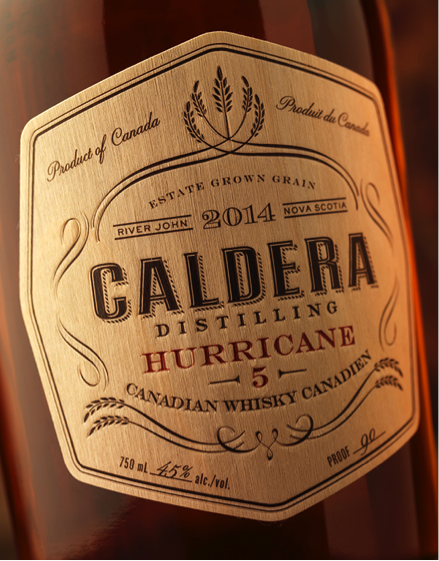
Labels are no longer relegated to paper alone. Now you can source labels made of pewter, wood or cast out of metal. These can be used as the sole label or in addition to a traditional label to provide a unique look to your package. Some of these can even be delivered on a roll much like paper labels and machine applied on a bottling line. Below are some sources along with some examples of packaging that has leveraged them.
- Pewter Label Sources:
- Cast Metal Labels Sources:
- Wood Veneer Labels Sources:
2. Foil – “All that glitters is not gold”
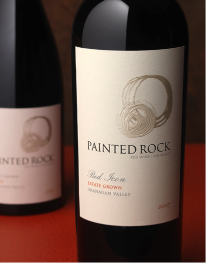
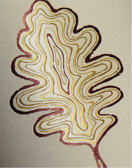
New foil types and colors are allowing printers and designers to get more creative with foil. The label below for Painted Rock Estate Winery was produced with a translucent pearl foil and printed with two subtle inks to add texture and dimension. The combined foil, print, and emboss technique create not only a visually appealing package, but a textural component that consumers cant help but pick up off the shelf.
Considerations For Specialty Foils:
- Ensure that the foils specified for production are indeed foils that can be overprinted with ink if you intend on doing so.
- Inks printed over or under foils often appear lighter, so specify inks a shade or two darker than the desired color.
- Keep your printer’s registration tolerances in mind when specifying multiple foils and ink that will register closely.
- Consider silk-screen or flexography inks as an alternative to foils.
3. Unique Use of Die-cuts
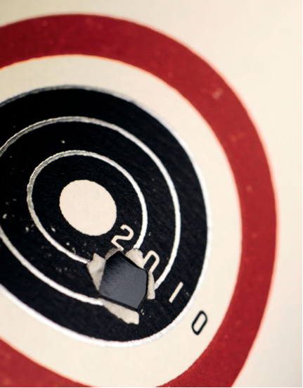
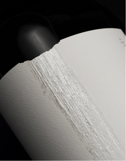
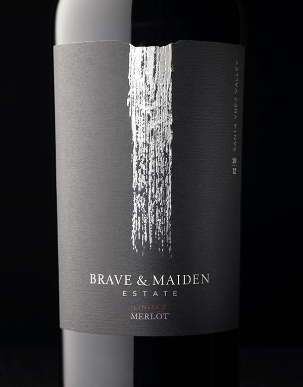
Advances in machinery, technology and laser die-cutting are allowing die-cuts to be more detailed, precise and cost effective than ever before. A die-cut label done well brings together the label, bottle, and even the color of the wine to execute a complete package design.
The die-cut in this Brave & Maiden Label provides the perfect visual touch to the waterfall – a key equity element for the brand. For the brand Slingshot the hole through the label perfectly communicates the irreverent personality of the winemaker.
Die Cut Considerations:
- Consult your printer early on in the design process to ensure feasibility of more complex die-cuts
- Consider which side of the label will be the “lead edge” during application to avoid labeling issues.
- Laser die cuts normally mean that labels will print slower and cost more to produce.
- Always run die black tests in order to avoid application issues.
4. Silk Screen
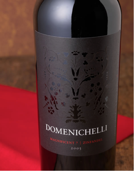
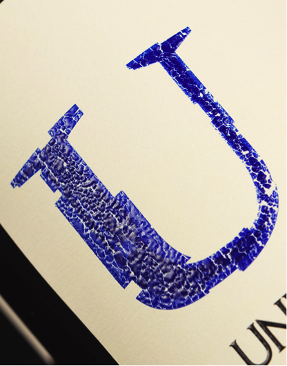
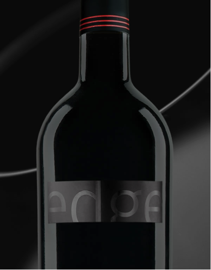
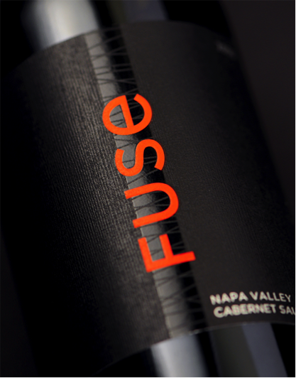
Alternatively to die-cuts, silkscreen printing can be used to achieve a simulated die cut effect or a “wet look” to the label as shown in the examples below:
Silk Screen Considerations:
- If possible, use high build silk-screens to retain embossed look after label application.
- Use silk screens to provide a “wet look” or to simulate a die cut through to
the glass. - Use varnish to matte silk-screens in order to give an embossed look without embossing.
- Silk-screening can bleed or sag during printing, so consider foils as an alternative for intricate details or tighter registration needs.
- A Brand to Aspire to - March 30, 2026
- The Core 4 – Setting the Foundation for Your Brand - September 19, 2025
- The Rise of Low & No Alcohol Spirits: A $4 Billion Bandwagon - July 21, 2025


Leave a Reply